


I was talking to a CEO recently that made the comment that they just got their board trained on NOT getting too far down in the weeds (details) when looking at information. As a result, the CEO wasn’t sure if our analytical offerings were right for board-level consumption. On the surface, I agreed with the CEO’s statement. For example, if you give board members easy access to operational data, they may be picking up the phone, sending emails or texts, and bombarding the CEO with a plethora of questions. Which, as you can imagine, can be unnerving.
However, after giving it a bit more thought, I could make the case that there are times to make data transparent and get down in the weeds when analyzing information. Remember, we always have the option to apply a little ROUND-UP when the data gets too weedy.
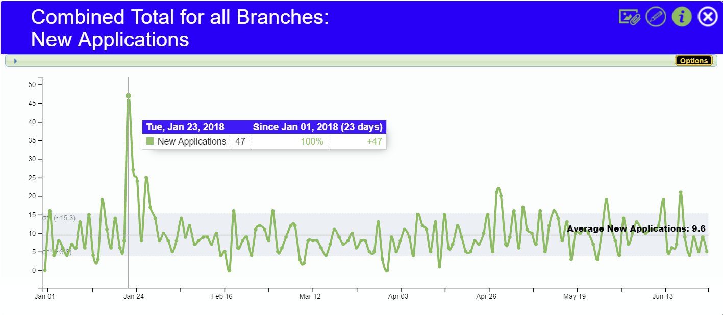
I’m going to use the trend graph below as my supporting argument on why it may make sense to make operation data available to high-level decision makers where they can examine granular data periodically.
The high-level perspective:
A statement a CEO might make to the board on a report may read something like:
“Our credit union averaged 9.6 new loan applications a day over the last six months.”
My argument for giving easy access to low-level (granular) data
Referring back to the graph, you can see why I’m making the case for offering this granular daily view of new loan applications over the last 180 days.
Looking from an average-only perspective potentially glosses over and completely masks what one could only call a SPECTACULAR event that took place on Tuesday, January 23rd, 2018. How did the credit union achieve such a high performance of getting 47 new loan applications in a single day when the average is less than 10 over the course of six months?
- Was there a promotion that yielded this extremely positive result?
- Was there an error in processing giving visibility to a possible operational error?
- Did it just happen by coincidence with no CAUSAL explanation?
- ???
Sure, by giving board members access to this level of information, they may reach out to the CEO seeking answers. But isn’t the real goal here to raise the daily average for new loan applications for the credit union? If there was a designed effort that caused the count to go nearly off the chart on that ONE day in January, wouldn’t we want to repeat that effort in hopes of maybe raising our new loan application average to maybe 15 per day?
Final thoughts
So yes, there is a risk of making data too transparent and possibly having to field uncomfortable questions, especially when the CEO may not be aware, which could portray low grasp. But by doing so, do we run the risk of possibly thwarting possible increases to operational performance for YOUR credit union?
Please weigh in on my comments with any reasons why this is or is not a bad case for taking a deeper dive into data and making your data more transparent to decision-makers. As a side note, this spike on the graph is the perfect example of when to add a notation explaining the event. A public notation here may eliminate the need for a board member to contact the CEO unnecessarily.