


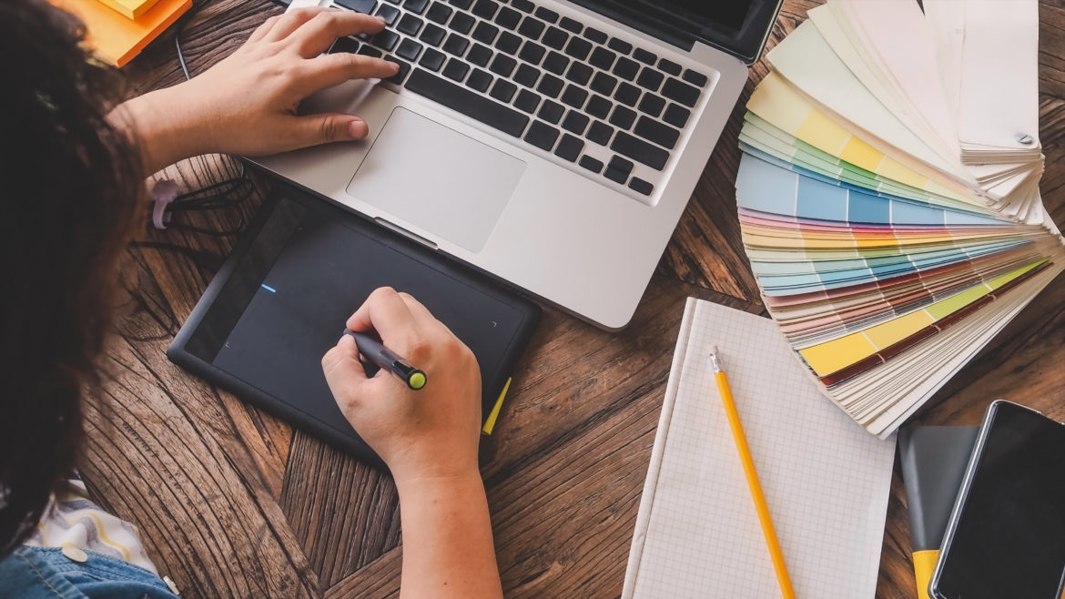
Graphic designers are necessary for creating quality marketing materials for credit unions. But it’s never as simple as just sending them an order—to make quality creations that help reach your goals, they’ll need a number of specific things from you, the client. Let’s look at five things designers will almost always ask for.
Your brand specifications
Your credit union’s brand is the fundamental jumping-off point for anything a designer can make for you. Without first understanding your brand, nothing they create will make any sense to your audience. A brand can contain lots of different items, but the main ones are:
- Your colors, in CMYK (print) and RGB (digital). Hex codes, like #11b14d, are another way of writing RGB values. Some brands also include Spot color values, such as Pantone swatches, for especially high-quality prints.
- Your typefaces and fonts. These include header and display typefaces, as well as the typefaces you typically use for smaller “body copy” in paragraphs. Specific font weights and styles are also good to note; for instance, if you frequently use bold or italics for headings, let your designer know.
- Your official logo (more on this later).
- Any key images, graphics, etc. that your audience always sees (e.g., a mascot).
Why does your designer need these things? Well, using or sending off-brand materials hurts the perceived quality of your company. When an audience member receives say a postcard with a familiar logo but the wrong colors, it might even cause them to suspect fraud. “Is this really from them?” they’ll wonder.
The reason your designer needs the brand upfront—as opposed to after creating a first draft—is to ensure consistency and save you both time. Yes, a good designer will be able to retroactively apply your brand elements, if necessary, but shifting aesthetics halfway through a project is a harsh limiter on the quality of the final product. It’ll take more time and be less cohesive than if they had your brand from the beginning.
Your logo (in the correct format)
Your logo is the face of your company, and you’ll probably use it on every marketing material you create, so giving it to your designer is a no-brainer. But it’s not enough to just email them a JPG and call it a day. The technical intricacies of print and digital design require specific formats to ensure your logo looks right. The required format depends on the medium.
For digital materials (email, web, social media, etc.), a high-resolution transparent image is required. It should be at least 1000px wide. The transparency is important; otherwise, the logo will be encased in a large white box. As the JPG format doesn’t support transparency, I recommend using PNG. Some digital materials will require a logo even larger than 1000px. For these, I recommend having an SVG (Scalable Vector Graphics) version of your logo. SVGs, like all vectors, can be scaled infinitely, meaning it’ll never get blurry or pixelated on screen.
For print, a vector file formatted in CMYK or Spot color is required. Because print has a high resolution of ink dots (300 per square inch), pixel-based raster files (JPG, PNG, etc) are likely to look blurry and pixelated. For this reason, the infinitely-scalable vector PDF, EPS and AI files are used.
It’s important to note that while you can convert, say, a PNG to PDF, it won’t suddenly become a vector file, and will still be unsuitable for print. The vector files you use should come directly from the person who designed your logo. If you don’t have these files, tell your designer! They might be able to hand-refurbish a raster file back into a vector.
The specifications of the final product(s)
It’s impossible to design a usable graphic without first knowing how it’ll be used. Is this a print piece? A Facebook banner? A direct-mailer? How wide should it be? These decisions will inform every other aspect of the piece, from color choices to the amount and style of copy. Generally speaking, your designer needs to know three main things.
First, they need to know the types of media you want. Second, they need the dimensions of each piece (in pixels for digital, in inches for print). For rarer, more unusual mediums (such as a digital ATM display), your designer will also need to know the resolution (in dots-per-inch) of each piece. If you don’t know these, send them a current file in use, and they’ll be able to extract the info themselves. Finally, for print, they’ll need any finishing information, such as bindings, punches, gloss coatings, etc.
It’s okay not to know all those things immediately. In cases where you aren’t quite sure which sizes or media types you want, be honest with your designer and open to their suggestions. They’ll probably have sizes and mediums they’ve worked with in the past! Similarly, if you’re thinking of making a suite of similar graphics in a variety of different sizes, such as for a large multi-channel campaign, let your designer know before they get started. Flexibility in design elements is never a guarantee—it’s the result of a concerted effort on the designer’s part.
Imagine you order a custom postcard at 3×5”, and your designer finds a beautiful photograph and weaves it together perfectly. Then you decide “why not have a billboard, too?” Well, unless your designer predicted this, it’s likely that the 3×5” photograph will be too small or blurry to use at that scale! They’ll have to start over from scratch, meaning more billable hours, and the two pieces might not match at all. If you’d mentioned that you were considering a billboard from the beginning, this extra cost could’ve been avoided.
It’s also important to specify whether the final products will be print pieces, digital graphics, or both. Though they can appear similar, print and digital formats have vastly different requirements. For most designers, digital graphics are simpler to create—the tools they use are digital, so you get what you see on the screen. The production of print pieces is considerably more involved for most designers, because unless they run their own print shop, a print vendor will likely be involved in the process.
In addition, print pieces require different color formats, higher resolution images, and special text formatting to guarantee the quality of the final product—it’s not as simple as taking a JPG and running it through the printer. For this reason, it’s imperative to mention whether or not you’ll need print pieces with your order.
Copy
Copy, in marketing-speak, is the written content of an advertisement or material. Note that the act of copywriting is different than the legal concept of copyright.
Your material’s copy is probably its key element. Without it, most ads would just be pretty pictures. You should think about the message you’re trying to convey, the reason why your audience would care, and the tone you’re taking with your promotion. Is it exciting? Is it serious? Is it just a fun pun? All are valid, but you should know which one you want. If you aren’t sure, run it by your designer; they’ll probably love to give their take on it!
Most designers are capable of writing solid marketing copy, but only if you provide the key information first. They can string together sentences, taglines and calls-to-action, but without the proper details, it won’t make any sense to your audience.
For a general credit union advertisement, your designer will likely need:
- A headline. It’s typically very short—think about it as a billboard, with no more than nine words, spotted as your target scrolls by. Note that unless otherwise stated, your designer can usually polish and condense the wording, as long as you provide the basic core concept. For instance, if you tell the designer you want something along the lines of, “You could win a prize for using your mobile wallet,” your designer could reformat it to a snappier “Use your mobile wallet and win!”
- A call-to-action. What do you want your target audience to do? Visit a website? Call someone? Apply for a loan? Without a clear call-to-action, your audience won’t know how to respond to your message.
- Body copy, or at least body content. Body copy is the bulk of an advertisement, organized into paragraphs or bullet points. You should give your designer as much of this as possible, even if it isn’t all used, but don’t worry about making it sound sales-y unless you have a specific tone in mind.
- Contact information. Even if your call-to-action isn’t contact-related, you should still provide basic contact info to your designer. Without it, you could miss key leads from target audience members who prefer direct communication (such as older members who prefer not to use the internet).
- Compliance and legal copy. This one’s complex, so I gave it its own section below!
Legal disclosures and compliance info
Writing legalese is everyone’s favorite pastime, but it’s not something any responsible graphic designer would offer to do for your credit union. Not only are they not qualified to write disclosures, they cannot accept the risk of guaranteeing the materials they create meet your credit union’s compliance standards. This is partly because the laws that govern credit union compliance are different in every state in the US.
Because of this, it falls on your internal compliance officer to send your designer any compliance logos (NCUA, EHO, etc.), required text (such as written disclosures, asterisks, and fine-print), and any other requirements. These should be included near the beginning of the project, as they can take up a large amount of usable space near the bottom of the material.
If you need a logo that you don’t have the file for, just ask your designer! If they work frequently with credit unions, they’ll probably have all the compliance logo files already.
While this seems like a lot, all of these are necessary for successful project execution. If you skip these at the beginning of a project, your designer will ask you for them later, or the quality and value of your final product will suffer. Note that because some of these remain the same from project to project (like your brand and logo), they don’t need to be re-sent with every new project, and once you and your designer get in a rhythm, these pre-production rituals will get smoother and quicker.
Just remember: every good design is a collaboration. If you work together, you and your designer will be able to create some amazing things.