


Remember when you were a kid and your mom gave you a slice of warm apple pie? Maybe you got a scoop of vanilla ice cream on top? Everything was right with the world, but then you glanced at your brother or sister’s plate and time stood still. Their slice was bigger than yours. Chaos erupted, and it was up to Mom to restore the peace. Whether or not it was true, the comparison was natural and instant.
Thankfully, there are ways to use those childhood comparison skills today. Have you ever looked at a spreadsheet filled with numbers, and your eyes glazed over as you became lost in the data? How can you compare the numbers if you can’t separate them from one another? A spreadsheet can be great and has its uses, but it can be difficult to interpret the data. If we can’t interpret the data, we can’t draw any conclusions about it, decide on a plan of action to capitalize on opportunities, or shore up risk areas. We lose the power offered by that data, and it becomes numbers for the sake of numbers. Blah. So, what can we do about that? Well, the solution is easy: we eat a slice of pie!
It has fewer calories than apple pie and it’s sadly, less tasty, but a pie chart can put your observation skills to good use and help with that pile of numbers. Transform those numbers into a pie chart, and we can quickly see who has the larger slice of pie! A pie chart converts the data into a visual form where we can easily comprehend who is eating the most out of our pie. It also lets us skip digging through the numbers and instead spend our time thinking about what the data means for our business practices, product portfolio, membership base, etc. Mom can’t play referee in the discussion of those pie slices, so it’s up to us to figure out why some slices are bigger than others.
Let’s put Mom’s pie away for now before we get hungrier than we already are. It’s time to explore how to put our pie skills to work in the business world. Here’s a pie chart that I’ll use to illustrate some tips for getting the most impact out of our charts. It’s a good start, but what can we do to improve it?
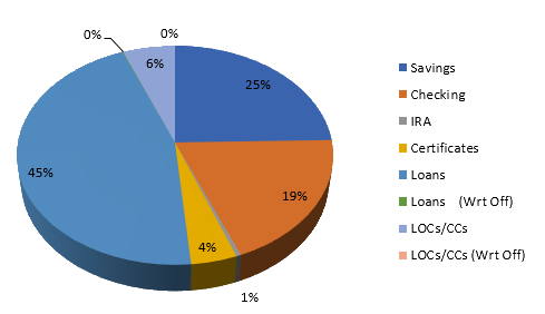
1. Keep the focus clear
The objective isn’t to impress with glitz, glamour, and aesthetic showmanship; the goal is to present visuals that clearly communicate an actionable message about data. A 3D effect is as far as we should go toward embellishment. Use color rather than monochrome to attract attention, but take care to avoid shades that are too similar. Color will help offset your chart from the text of a report of presentation.
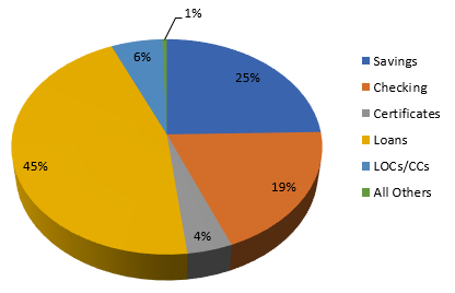 2. Consolidate data for clarity
Does a 0% slice make sense? We should consider consolidating very small slices into an “Other” slice to avoid muddying the chart’s overall message. In the chart to the left, we’ve consolidated the 0% and 1% items. This weeds out unnecessary and irrelevant data.
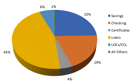
3. Declutter
Think about our apple pie story. Did you measure the slices your Mom gave you and your siblings? Or could you tell at a glance which slices were bigger? We should consider whether the labels on our chart slices detract or add value to our chart. Are they distracting? Let’s keep the labels but move them off the slices to improve readability.
Pie charts offer a quick way to understand the relationships between parts of a whole so we don’t need to sift through a spreadsheet. Try making some of your own and experiment with different options! Just remember not to get carried away with style; keep it simple and clean with a clear focus.
Author


Comments


chip Filson#1
Good, clear example. Well done.