When it comes to email marketing, the goal is to reach your audience no matter what industry you are in. So how do you make your email stand out? You know the saying “Don’t judge a book by its cover” well in this case your audience is. According to Litmus the average time spent reading an email is 10 seconds. Just 10 seconds. 10 seconds to stand out and get your message across.
So how do you reach your audience in those 10 seconds? Well, the best way to start is by having a successful email design, which comes down to five main points: a subject line, a call to action, layout, imagery, and the signature.
Creating the perfect subject line
The very first thing your audience is going to see from you is your email’s subject line. It can be nerve-racking to come up with something creative for every email, but there are some basic things to keep in mind when writing one. You want them to be intrigued by the subject line, so it should be something that draws them in and separates you from the hundreds of emails in their inbox. This is the time to have your credit union’s voice come to life, as the subject line will convey how you want your audience to see you.
Do you want to come off as friendly and creative? A fun pun or a play on words can show your creativity and give your email a personal touch. Some even use emojis, but these can hurt your brand credibility and are not always accessible to everyone, so make sure you are using them sparsely and with the right audience. When showing advertisements, lead off with why they would want to click on that advertisement by asking a question or adding a statement on how this benefits them to create interest. Make sure your important updates stand out with direct statements or labels.
When coming up with ideas, not everything is going to be a winner, but there are things you can do to make it easier! Practice makes perfect! Bouncing ideas off other coworkers or colleagues can also help you come up with more interesting subject lines. Even looking at your own advertisement emails can help you. What made you want to click and open that particular holiday deal email? What phrases did they use? Did they use an emoji, a pun? Was it advertising the sale price that made you want to click? Apply these techniques to your own tag lines and see how your audience interacts.
Decide on your call to action
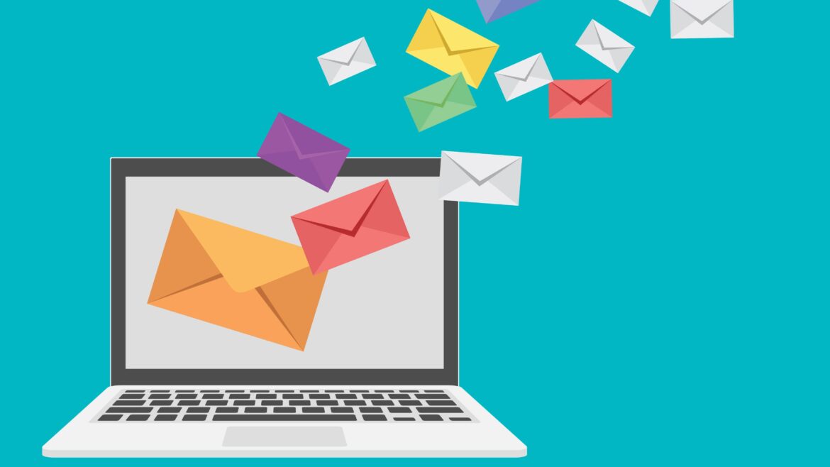
Now that your audience has opened your email, we need to make sure you have a clear call to action. The call to action can be a link, button, or text you want your audience to click on. Having a call to action gives your email an interactive element and continues the path to your social media, website, pdf, video, etc.
The easy way to create a call to action is by having a clear hyperlink visible in your email. These can be linked to anything you want your audience to see. Another way is having a button clearly labeled with directions or verbs like “click here,” “subscribe,” “download,” “order now,” etc. You can also have these labeled with what they link to. Icons are also a great way to link social media in your emails, these are recognizable and provide them a clickable call to action. If you have a photo in your email, make sure it links to your end goal as well.
Layout and hierarchy
Now that you have an action item, it is time to work on the layout of the email. Something to keep in mind when creating your email is to make sure your email is readable on all devices including desktop, tablet, and mobile. Most email creation software allows you to preview how your email will look on your audience’s various devices.
When in doubt, having your email in either a linear design or single column layout with a width no greater than 640 pixels is the best bet. This lets your email be accessible, easy to adjust for screen sizes, and with only one column it doesn’t overwhelm the viewer. This also keeps your email simple because as we know, you only have 10 seconds and that clock is already ticking.
To make sure your audience isn’t missing out on any valuable information, it’s time to implement a hierarchy. By setting a hierarchy, the important information will stand out from the rest and create a clear viewing path. The viewing path is the order of how you want your audience to view elements in your email, with email marketing we have clear labels for these.
H1 is the main headline or title and is the largest text of the email. H2 is the secondary headline containing important information as well but is smaller font than H1. H3 is the smallest headline and is normally a category title or multiple headlines separating information into sections. The rest of the wording is the smallest font and is typically a basic font and basic color for readability. It also holds the details of the email and is called the paragraph.
Easy ways to define these include font size, color, and thickness or boldness of type. An example of this would be an H1 that is somewhere between 24-30px, in a bold color (assuming the paragraph text is black), and in the bold type of your chosen font. If your branding includes color don’t forget to add it to your email, this can add another dimension to the hierarchy, but make sure that the text found within is readable—we don’t want valuable information to be lost!
When adding custom elements having your colors, font type, and style matching your credit union’s branding keeps everything your audience sees universal and recognizable.
Images, icons, and symbols oh my!
The wording isn’t the only thing that is important in your email, adding imagery is just as important as the text. According to HubSpot, about “40% of people perceive visual information better than plain text.” When adding an image to your email, it is best to know that images can be blocked by some email software, and that is okay! It doesn’t make your credit union lose creditability, and even if you do everything you can, some email software will still block images.
But fear not! There are some ways to prevent this! First, avoid putting all your text in one large image because if it does get blocked your email will only show one big white box, and if it does load, the readability of this image will be difficult on some devices and the load time will be extended. To prevent this, make sure your image is 600 pixels or less.
If your image or images do get blocked, most email software comes with a download image option, a clickable link, or a button for the viewer to view this email in a website version. This helps with email readability, so if the software does block or distort your email, the viewer can still see everything in its intended format.
This also applies to icons or symbols, which can be a great way to show your branding! These can be used for common things like your logo and social media platforms. Having your logo included in your emails is important, it not only builds brand recognition but also prevents your audience from thinking your email is spam and adding it to the junk folder. Or worse: unsubscribe. Having other types of symbols or icons can also relate to your H3 headlines by giving it visual appeal, emphasis, showing your innovation, and illustrating what you trying to say through your text.
Signature
Now that we have successfully set up your perfect marketing email, it is time to apply the finishing touches by adding your signature. Signatures can display a variety of information. The main purpose is to supply the viewer with your contact information and an ending point to your email. This prevents them from continuous scrolling and gives them a defined end while providing your contact information as an ending focus.
The way you display your signature is completely up to you! My recommendation would be to add your credit union logo, general contact information, and location. You can add an employee’s contact information and a headshot for a more personal touch if you’d like. Or you can add your website information and social media links, which works as a call to action as well. These are all great endings, and with the final addition, you have successfully created a marketing email!


