Email is still an effective marketing strategy in 2021 and building your subscriber list is one of the most cost-effective ways to reach your audience. This is especially true for younger generations who do not often use traditional media like radio or television. But how do you go about building a list without overwhelming or annoying people? What components are necessary?
Rather than explaining basic copy strategies like AIDA (Attention, Interest, Desire, Action) or PAS (Problem-Agitate-Solution), I would like to go more in-depth about some effective ways to structure a landing page that resonates with your visitors and also a way to write compelling copy that leads to visitors taking an action on your landing page.
Firstly, what is a landing page and why do you need one?
A landing page is simply a single webpage that consists of hyper-relevant information. Landing pages are mostly applicable if you are trying to achieve one desired result. In the case of this article, gaining email subscribers.
Let’s say, for example, you create a Facebook or Google advertisement, and your goal is to grow your email list. The last thing you want to do is send that traffic to your main website. Why? Because your conversion rates will be low, and you may have a lot of wasted ad money.
That is because the information on your main website is unlikely geared toward the main purpose of getting email subscribers. Your main website does not have one specific goal in mind like a landing page where you can tailor the content copy to your audience.
Now that you know what a landing page is used for. How can you use one to grow your email list and what do you need to do to make it happen?
Your ideal member
To make competition less of a factor, a lot of marketers are shifting their marketing efforts toward focusing on a particular niche or group of people. This helps make marketing copy and ads resonate better with a desired group of people. You may be familiar with the term “ideal customer”. Defining your own ideal member can be a beneficial way to increase click-through rates (CTR) and keep your cost of ad spend low while also bringing on great members that are a pleasure to serve.
Create your freebie offer
Before you begin creating your landing page you should brainstorm a few freebies offers. The reason for creating a freebie offer is to give your visitor an incentive to give you their email address. It is an easy and effective way to get new subscribers on board, and it will also reduce unsubscribes because they’ll feel like they’re getting something in return.
Checklists, guides, or e-books are great for freebies, this is where you will want to get creative and think of something valuable you can offer. Consider creating something your user would be excited about. Actionable content tends to perform well; meaning something the user can take and use right away.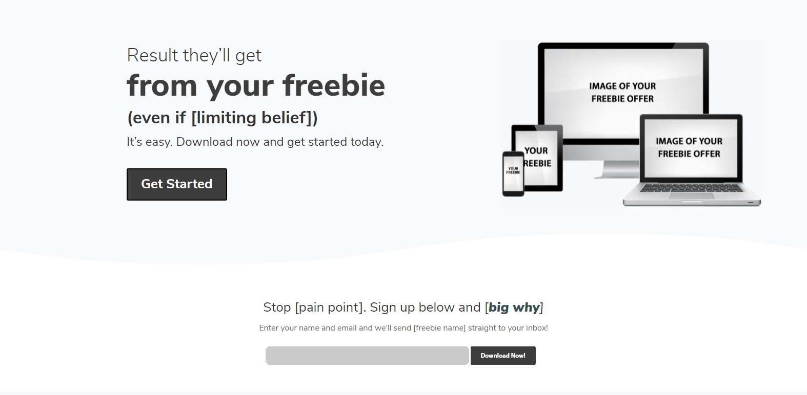
Creating your landing page
So, you have your freebie offer created and a method for driving traffic to your new landing page. How do you structure the page and what should you include to make sure you are giving yourself the best chance of success? Here are a couple of ways to structure your page and the content that goes along with it.
Four part call-to-action
The first thing you want to include at the top of your landing page is a call to action that is clear and concise. I will show you a quick example of creating your 4-part call to action.
Let’s say your freebie is a checklist of “50 ways to save money for your next vacation.”
- Result – Start with the result your ideal member will get from downloading your freebie offer. Try to think of something tangible and concrete. Example: Save $500 dollars.
- Limiting belief – This is where you can jot down some ideas of why your potential member might not believe they would be able to achieve the result. Example: Bad at saving money.
- Pain point – This is where you will want to brainstorm ideas of why your ideal customer is looking for your solution, to begin with. What is bothering them? What is keeping them from their goals? What is a pain point they have that needs to be solved? And can your freebie be a step in the right direction to help them solve their problems? Example: unable to enjoy spending money for weekend fun.
- Desire – Now think a little deeper about what this person really wants. This section is not about their problem, but more about what will be possible for them once they no longer have the problem in their life. What will they be able to do now? Example: travel more, enjoy splurging, feel free, give back.
Now take your answers for each of these and craft your message by using the screenshot below to write a call to action that resonates with your ideal member.
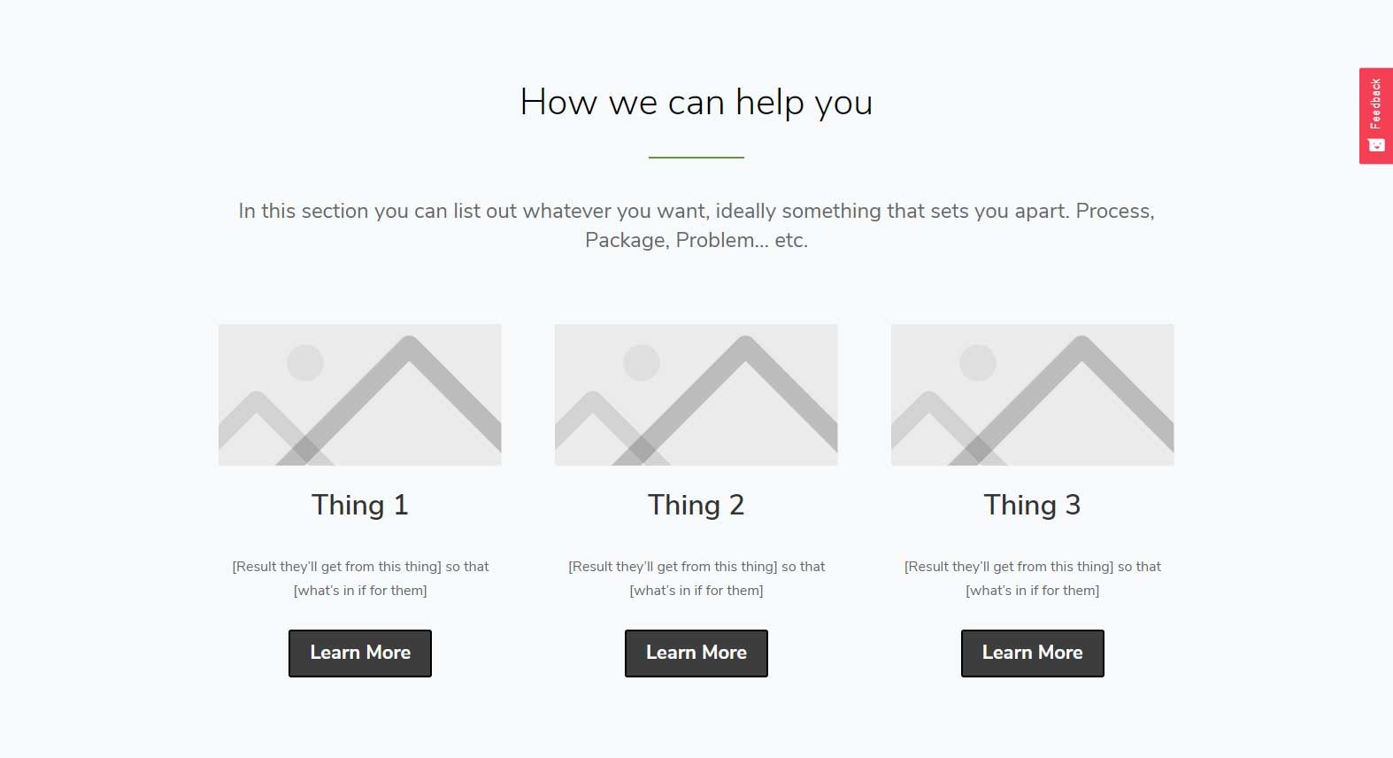
How we can help you section
In this section, you can list out whatever it is that your credit union can help your customer achieve with your services. For example, you could introduce a unique process you have or a list of services. Just make sure that you include the result that they will get and a section about what’s in it for them.
- This is right for you if – This section is where you will give your visitors information about why you are the best choice for them. Highlight their pain points and let them know about prove to them it’s a step in the right direction.
- Testimonials – This section is optional but if you have testimonials it can help to add them to build trust and further influence your visitor’s decision to grab your freebie so they can get on your email list.
- Blog – This is also optional but if you have a blog full of other valuable content that your ideal member would find useful you can add it to your landing page. Make sure you have a way for them to get back to your freebie offer though just in case they do happen to click away from your landing page.
- Call to action two – You want to insert your main call to action a second time so that it is easier for your user to know what the next step is. If they made it all the way to the bottom of your website without clicking away that is a great sign that they are interested so give them an easy way to act.

Thank you page
You want to make sure you have a thank you page set up for your users to navigate to once they sign up for your free offer. There are two good reasons for having a separate thank you page.
Firstly, you’ll be able to set up goals in Google Analytics and track the number of times users land on your thank you page. By setting this goal, you will be able to benchmark your efforts and see how many subscribers you are getting. You can then use this data to tweak your page or offer and hopefully improve your numbers.
An often overlooked but effective tactic of the thank you page is to ask for feedback. You can add a form with specific questions about how they found you or ask your new subscribers to follow you on social media or to join your Facebook group. Especially when offering something for free, people generally feel more inclined to say yes.
Conclusion
Hopefully, this article helped generate some ideas that you can use in your own business. Now it is your turn to generate some ideas. Hopefully you were able to learn something new and can take these ideas to build your own list of new prospective members to market your services to.
