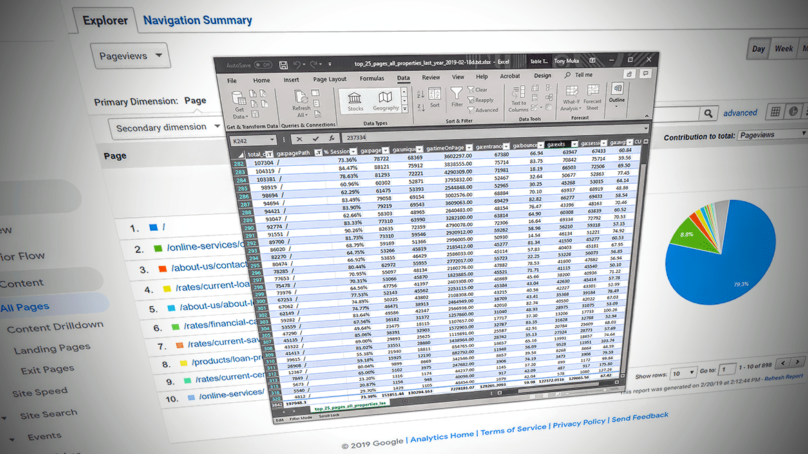
You want your website to be a polished beacon of light, beaming knowledge of your best services directly into your member’s home or mobile device, right? Of course, you do! We’ve crunched the numbers on actual CU website visitor traffic to help you decide how to put your best foot forward when it comes to your website’s information architecture.
#1 Your Homepage!
No big surprise here, on average 73.39% of all your CU site traffic is to the front door of your website. Your most important promotions, news, and information belong on your front page for maximum impact. Visitors don’t want information overload here, so you’ll want to make decisions about your marketing priorities, drawing interested visitors in to click to learn more about the details or to sign up. The content on your homepage should be current and refreshed regularly to catch your member’s attention. Bonus points to you if it’s easy to find links to the next top pages visitors are seeking.
#2 Online Banking Login
Members are most often visiting your website to check their existing accounts. Whether it’s to see if their paycheck has cleared yet, or if they’ve saved enough for that vacation they’ve been dreaming about, you should make it as easy as possible for them to quickly log-in to Online Banking from your homepage. You’ll want this login link or form on your homepage so that members have an opportunity to see the other curated promotions and information you’re currently featuring. Resist the temptation to create a page solely for Online Banking Login and information since on average 6.48% of members may bookmark this page or navigate directly to it from a search engine result, then miss out on your homepage promotions.
#3 Contact Us / Hours & Locations
Okay, you’re right, this could be two or three pages, but however you slice it up, your members want to know where to find you, how to contact you, and when you’re open for business. On average 2.44% of your visitors are looking for this information. Placing this information or linking to it from the header or footer of your website will allow members to quickly and easily find you, and again give visitors an opportunity to also see your latest featured promotions and information.
#4 Rates
Savvy internet consumers price shop, so if you’re not advertising competitive rates on your website you may be missing an opportunity to convert views into new business. If this 1.60% of your visitors don’t see a rate they like on your rates/products page, you’re unlikely to get a second chance to offer a better option. Be sure to link to online loan and membership applications along site your rates so your visitors can take action when they see the rate they want! Showcasing your best rates on your homepage is a great way to be sure website visitors think about you next time they’re shopping for a new loan or investment.
If you’re noticing a recurring theme here, good job, you’ve been paying attention. Most of your visitors see your homepage, so focus on making that great before you move on to the inside pages of your site. Detailed content on inside pages may help lure in new visitors by increasing SEO (Search Engine Optimization), but that’s a story for a future article.
*Statistics are based on analytics data on the top 10 most popular page URLs per site, over 1 year on 86 credit union sites with greater than 4000 sessions in the year.

