Millennials have always been a hot-button topic it seems, with discussions focusing on which industry they’re currently working on killing, why they refuse to do things the way generations before them did, and more importantly, how to market to and connect with them. Now, the generation below them, Gen Z, is being met with similar confusion and head scratching. But with a combined spending power of nearly $3 trillion, connecting with Millennials and Gen Z isn’t optional—though the process of marketing to them and engaging them is a complicated code that financial institutions just can’t seem to crack.
Take Gen Z’er Bolun Li, for example. While in high school, Li recalled a “financial literacy” seminar in which a bank representative came to his school and gave a long lecture on personal finance. After two long hours of his classmates staring at their phones and no one feeling engaged in any way, the representative tossed out some flyers that read “Open a checking account with us and get $20” before leaving. Needless to say, none of his classmates opened that account. And more importantly, none of them had learned anything about finance.
Cracking the code
It was this interaction that inspired Li and two of his classmates, Simon Komlos and Simran Singh, to create an app that would properly support their generation (and others) in becoming financially literate in a way that was engaging for them and would reward them for doing so. The app, Zogo, which now has over 350,000 users, hits on all the topics Li feels younger generations need and want from their financial institutions: a beautiful and intuitive app, rewards they can enjoy, and trust for the institution. These three traits are where he feels younger generations place their value, and where credit unions and other financial institutions may be missing the mark.
Now that’s not to say credit unions are completely failing at appealing to the younger generations. In fact, Li argues credit unions may have advantages that other financial institutions—such as banks and FinTechs—do not, however, they’re not using them effectively. First, is the credit union mission statement. Millennials and Gen Z care about the social responsibility of the organizations and companies they purchase from and work with. As not for profits with a care for their communities, credit unions certainly qualify as socially responsible, though their inability to market that to Gen Z almost makes it null and void, Li notes.
Furthermore, unlike digital FinTechs, credit unions still have branches, which despite the ever-growing argument that branches are on their way out, is still an option Gen Z wants—though not in their current form. And as for the big three things Gen Z looks for in a financial institution: beautiful apps, trust, and rewards, credit unions may seem to check all the necessary boxes on the surface, but Li argues they’re not going about it the right way. So how can credit unions improve on these things?
Form and function: both are important
Mobile is everything. If you don’t have a great mobile app, you can pretty much count yourself out. “But our credit union has an app that works really well!” You might argue, and you might be right. But does it have the clean and beautiful design that we see with new FinTechs and NeoBanks? More than likely, the answer here is no. Li conveys that while credit unions and even banks may have perfectly functional apps, they fail in their designs, which are outdated and clunky. This may seem very surface level, but if younger generations feel something has poor design or won’t be interesting to engage with, their trust in the institution can be hurt, and they may be less inclined to use that institution. Is this drastic, choosing a financial institution based on its aesthetic? Maybe. But that doesn’t change the fact that a clean and beautiful app will win over an outdated look any day.
As for intuitive, these clunky designs only hurt the app in this regard. It’s harder for members to find what they’re looking for and getting where they want to go requires way more navigation than should be required. Information should never be more than a page or two away. Make it any more complicated and you’ve lost their interest. This also applies for things such as referrals and claiming rewards. These should be completely digital and able to be done in about a minute (more on that later).
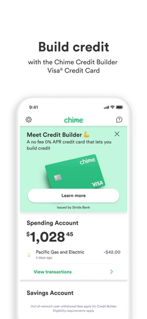
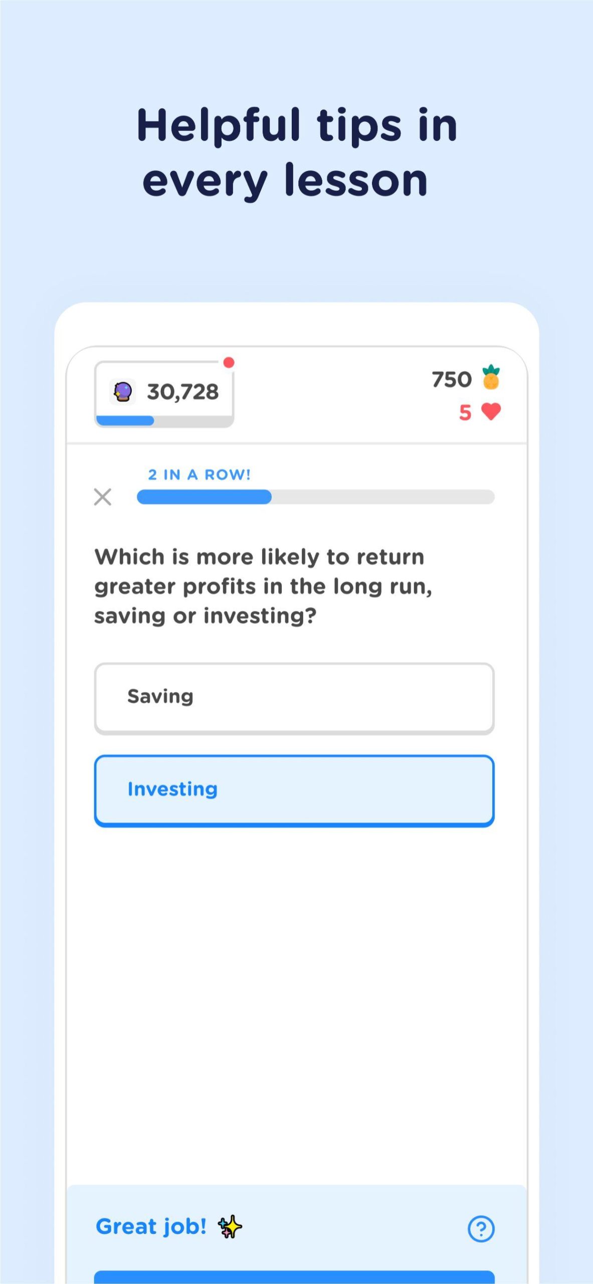
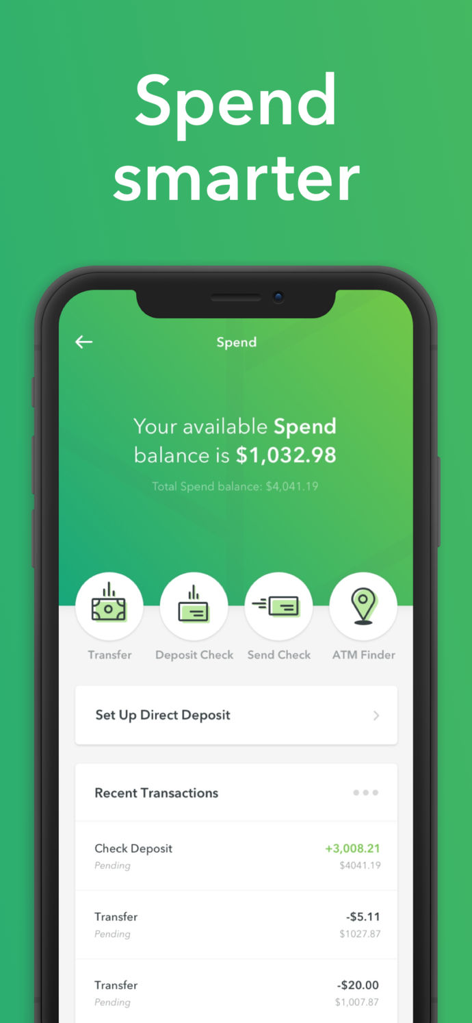
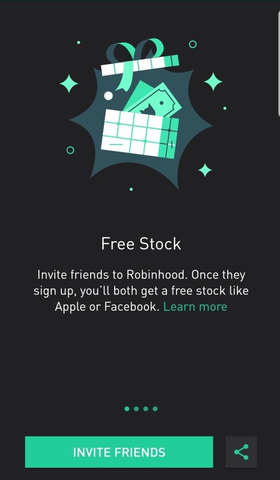
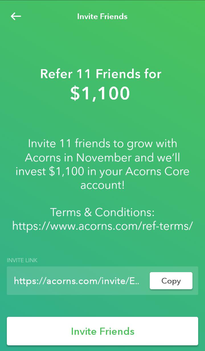
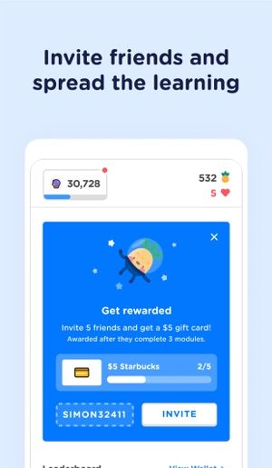
Below are some examples of modern apps, including Zogo, that have the design and look younger generations want in their apps. Does it look like your app?


