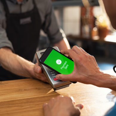
Imagine being next in line at a department store when it suddenly occurs to you that you might not have enough in your checking account to cover the total cost. You whip out your phone, sign-on, and just as the loading screen is about to bring up your balance, an ad appears telling you about a special offer you might qualify for. Thoroughly annoyed, you swipe the offer away to finally reveal your balance.
As product designers, we need to tread carefully with interrupting a member’s sense of urgency. With the availability and convenience of mobile banking and biometric authentication, a member could be checking their account information while shopping, cooking dinner, or scrambling to get kids in the car…even driving. Over the past 20 years of digital marketing strategies, all of us have experienced overzealous targeted marketing efforts and annoying pop-up ads that fail to find the balance between features, UI/UX, marketing, and member communications.
User experience or member experience?
If you are in the camp that believes user experience reigns above all else, then the solution would be to never market to your members through mobile banking. Members should be able to easily and quickly navigate to any features or account information without any interruption or distraction.
Others will argue that member experience should be the goal. Mobile usage is continually on the rise, so informing members about pre-approved loan offers or the ability to skip a payment is helping the member understand their financial options and therefore, improving their overall member experience.
Here at Mobile Technologies Group, we understand that both are important and that our product design strategies should strive around finding that balance. Moreover, acknowledging that whatever effective solution we put in place today may very well be ineffective two or three years from now.
Should mobile marketing be more like a tollbooth or a billboard?
Let’s be real, requiring a user to dismiss an ad to access a feature is essentially requiring them to pay a toll before proceeding. Both are annoying and delay getting users to their desired destination. Additionally, do we really expect members to engage with a promotion right in the middle of performing a transfer or checking their balance? If we don’t start factoring in mobile-first marketing opportunities in our effort to make innovative user interfaces, it will likely lead to poor user experiences if we try to inject them later.
Maybe mobile marketing should be more passive, like a billboard? Typically, when drivers pass a billboard sign on the freeway, they don’t feel interrupted or delayed by them. Most have neutral opinions unless funny, relevant, or relatable. Just like a commute, one of the advantages credit unions have with mobile financial apps is that users have many reasons to return. Factoring in conveniences such as biometric authentication, users can effortlessly check their balance two or three times a day, anticipating a direct deposit paycheck or tax refund. This statement alone will get any traditional marketer excited about opportunities to make checking your balance a marketing opportunity every time you use it. So, here we go again…tollbooths!
One of the downsides to passive billboard marketing is the average time a driver might have to view it. Six seconds or less to engage, entice, and be memorable enough for drivers to retain the message. What if financial, mobile-app marketing could engage and intrigue but not require the member to recall information? What if your marketing and member engagement opportunities could have an unassuming home in your app that users could return to but does not feel like a tollbooth for accessing features?
Dare we consider the sacred login page?
Consider big bank mobile apps. Chase, Huntington, and Capital One, for example, all use the same old traditional model where login pages get premier mobile real estate and are prominently displayed every single time you launch the app. Because of this inflexible model, at one point, Chase flirted with dismissible pop-up ads that appeared over the login when launching the app. An unwelcome tollbooth marketing practice that quickly went away shortly after it began. Only recently did Wells Fargo take more progressive steps to include unauthenticated content alongside its login. Does this solve the problem?
Well, in cases where biometric authentication is available, many apps have now conditioned their users to automatically prompt fingerprint or FaceID as soon as the app launches. While I would agree with the convenience, this does mean that an increasing percentage of users won’t even see content or marketing that might exist on login pages. It could also frustrate a user who only wanted to find a branch or ATM quickly. So, now we find ourselves having to create UI and marketing strategies for both traditional authentication and biometric.
On-demand authentication
Back in 2016, my CUSO decided not to follow in the footsteps of big financial institutions. Instead, we implemented a progressive and, at times, debated concept of an unauthenticated home page in the app with authentication being “on-demand.” A method to help condition our credit union members that authentication was more like Google or Apple Pay, where it only prompts when needed. Similar to how Amazon lets users shop and add items to their cart, only requiring the user to login when checking out. This model not only allows users to access unauthenticated content faster, but it also allowed us to create an adaptive and customizable home for marketing promotions, new mobile feature announcements, and general credit union information without feeling like a tollbooth. Whether our members use username/password or faster biometric options like fingerprint or FaceID, the user experience is the same.
Another benefit of on-demand authentication is letting potential members see your marketing and mobile features before joining your credit union. We shouldn’t underestimate tech-savvy individuals who might download an app to verify the credit union has a needed feature like RDC.
To lead or to follow
So far, big financial institutions still seem to be “banking” on traditional mobile app marketing approaches. Should credit unions continue to follow in their footsteps? Or should we continually evolve our member engagement and marketing strategies as fintech technologies evolve?


