


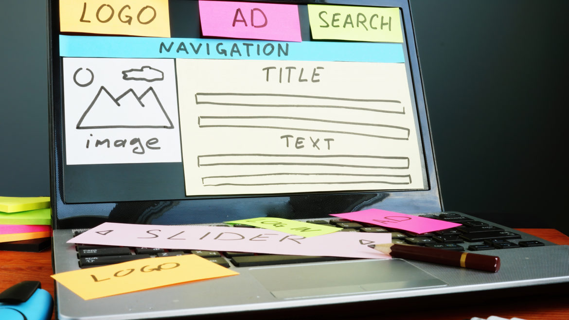
Building your credit union a new website or modifying your existing website can be a daunting task. Whether you follow trends in the industry or study where you should place your effort, there are so many options that it can feel overwhelming.
While a team of experts can be there to help you, it is a good idea to know what NOT to do, and how to avoid or fix them if you are currently doing them. Let’s take a look at a number of things driving your users away from your website, and see what we can do to fix them.
Slow loading times
Our first mistake is the easiest one to identify, fairly simple to avoid, and is one of the hardest ones to resolve. A slow website is frustrating to everyone and can easily be compounded by a frustrated user refreshing the page thinking something is wrong—thus increasing the load on the server providing the site and starting the user loading the slow website all over again!
Let’s first address ways to avoid having a slow website. If you are using a Content Management System (CMS) such as WordPress, there are several things you can do. First, hiring a professional web developer will go a long way toward creating a speedy and quick website. You may save money having your nephew create a website, but the pros know best practices and have the experience to create a sleek, minimal website.
Second, minimize the number of plugins you use for your website. While plugins are powerful tools for extending the functionality of your website, consider the impact they have in loading more resources and code into your site. Are they adding value to your user and their experience? If not, then you can likely forego having them on your website.
Third, utilizing caching—whether it is on the server, or using a plugin (these ones are worth it), having a cached version of your website will save bandwidth and increase the speed of your site for your users. Lastly, if available from your hosting provider, consider using a Content Delivery Network (CDN). These function by using a network of interconnected servers that speed up webpage loading by caching content close to the end user’s location. Popular hosting providers like WPEngine can utilize a CDN for your website.
Now for trying to fix a slow-loading website. There can be many causes, and identifying the underlying issue can be complicated. Using developer tools provided by Google Chrome, we can start gathering some data to see where the slowdown is happening. The Network tab of developer tools will give you a graph of elements loading into your website, as well as a list of elements being loaded. Check which ones are the largest in terms of file size—these are typically images. I recommend optimizing all images for website use, as this will reduce the file size and overall size of your website. You should also run a Lighthouse report—available in the Lighthouse tab—which will give you a detailed report of your website with any issues and tips for resolving those issues.
Non-responsive design
While not very common nowadays, having a website that doesn’t respond to mobile devices will push users away from your website. To avoid this issue, have a discussion with your designer and developer to ensure they’re putting mobile first and the design will respond to mobile devices appropriately.
The easiest and best way to fix a non-responsive website is a redesign—attempting to modify your existing site design to be mobile responsive is often expensive enough to warrant a redesign.
Elements that typically aren’t mobile-friendly and responsive are also a good thing to keep in mind for your credit union website. Large tables and tabbed content often translate poorly to a mobile device because squishing or resizing the content can often lead to strange sizes or content spillover.
Try keeping tables small, or if you already have large tables that aren’t mobile-friendly, break them up into multiple tables with only a few columns. The same goes for tabbed content—limit the number of tabs for any content that needs to be tabulated or try something different such as an accordion.
Cluttered or disorganized layout
We often hear praise for “clean” “-looking websites, and there is a good reason. Overwhelming your users with too much information or visual clutter can be distracting from your message and make it difficult for your users to find what they are looking for. To avoid this mistake, try giving any element on your website some breathing room—use whitespace, borders, and other visual tricks to provide ample space for individual sections and elements of your website.
Take your users on a journey through each page, and tell them the information they need as they continue down a page. Don’t be afraid of having a user scroll, mobile devices are a common way to interact with technology and scrolling is a natural behavior of these devices. Websites like Facebook and Reddit are extremely popular and are naturally scrolled, so your users are very familiar with how to interact with a website that intends for its users to scroll.
To fix a cluttered or disorganized website, first assess what information on a page is the most important. Cut out anything that doesn’t add to the purpose of the page and evaluate why it is there. Break up your existing content into more digestible bits, and don’t be afraid of some whitespace.
For home pages, consider what your user is coming to your site to do—for credit unions, this is typically online banking, your rates, routing number, or phone number. Place this information in clear, easy-to-find places near the top of the page. Don’t worry, doing this will still leave you room for your marketing messages!
Confusing navigation
Making your users guess where the information they need is located is a surefire way to frustrate them off of your website. We’ve all used a website before that left us saying “Where is it?” in total frustration.
The good news is this problem is easily avoided and also easy to fix with both following the same process. I recommend organizing your pages under common items (Loans, Savings, About, Contact Us, etc). Then place each individual page relevant to the common items under them in the navigation.
An outline of your pages (commonly called a sitemap) will help you visualize the flow of pages on your website. Avoid having too many or too few pages. If each page under a top-level menu item will only have a paragraph or two of text, consider combining it with another small page under a common name. Likewise, if a page is going to have many items on it (say, 10 or more subheadings), consider breaking those pages into separate pages with new titles.
Poor readability
This one may sound like avoiding word soup, but the problem is with a few design elements. Text that is too small, on a busy background, or with poor contrast will have users’ eyes move right past it and miss your message for any section containing it.
Again, with this mistake, avoiding and fixing the issue is the same: make sure your text is a legible size, avoid placing it over an image (unless you use a dark semi-transparent overlay on the image with light text), and use high contrast colors. Not only will this fix and avoid an accessibility issue for your potentially visually impaired users, but it will also help all users properly see your message and make it easier to read.
Lack of search functionality
Have you ever used a website and been unable to find what you’re looking for, only to discover you can’t find a search box or icon? This mistake will leave the potential user very frustrated and send them to another site to find an answer.
Avoiding this mistake when creating a website is simple: include search functionality, preferably in the header (but the footer works as well). Including the search functionality in the header allows a clean and easy responsive adaptation to mobile devices. This can be represented with a traditional search box or a magnifying glass icon that pops up a search box.
Fixing this mistake may mean making some design changes or positional sacrifices for some elements on your page—the reward of not frustrating your users is worth the additional work of rearranging header or footer elements.
Help yourself and your members
Avoiding or fixing common UX mistakes will help keep users engaged on your site instead of sending them quickly to your competitor. I have covered a number of issues here, and there are plenty more that we see often that I will cover in a follow-up article.
Issues such as slow loading times, non-responsive design, a cluttered or disorganized layout, confusing navigation, poor readability, or lack of a search function frustrate users and make them believe your website is not worth using. Ensure your investment into your online presence is worth the time, effort, and love you have put into it by making sure to avoid these mistakes (or fix existing ones) and your users will thank you for it.