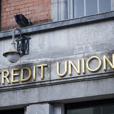


When it comes to marketing your credit union, it’s important to be mindful of the level of polish your materials exhibit. In a matter of seconds, members (and prospective members) will use their eyes to determine the value of your business—categorizing it relative to other brands as it finds a home in their minds. As crazy as it sounds, those precious few seconds could ultimately determine whether they choose to invest in you or not.
Feeling the pressure of these initial impressions, credit unions and small businesses turn to professional graphic designers and copywriters to handle their communications, which is an excellent idea! But sometimes disconnects between clients and creators can lead to a prioritization of polish at the cost of everything else; this can hurt small brands in some interesting ways.
How polish helps
The benefits of beautiful graphics and snappy copywriting are obvious. Quality materials exude a professional aura, showing audiences that your organization has the resources and tact to produce and launch high-quality stuff. Clear, error-free writing is especially crucial in the financial industry, where it’ll convey your attention to detail and trustworthiness with members’ investments. Polished, professional advertisements are often eye-catching and memorable, since they rely on solid, proven ad techniques to capture and keep your target’s attention. And they position your brand as a high-value one, worthy of the money you charge for your services.
Alienating your audience
But when you focus too much on polish, it can begin to alienate your target audience. People don’t want to feel advertised to, even by straight-up advertisements; many despise feeling patronized, and unless you’re meeting them where they’re at, even the world’s catchiest slogan won’t sway them in your favor. Good marketing is more about communicating effectively than making objectively good materials—if you don’t hit your target, you’ve failed, regardless of how pretty your ad is.
A good way to overshoot your target is to over-globalize your brand. As a primarily modernist designer, I love creating the kind of serious, geometric international-style Helvetica graphics beloved by big banks and corporations, but I’ll admit that a lot of people associate them with cold, corporate anonymity.
Imagine a small credit union with the BP logo—it would look far too self-serious and probably keep people from realizing that they weren’t dealing with a faceless global conglomerate. It would invite direct comparisons between the credit union and much larger entities, which might not be particularly flattering. And worst of all, the true target—people who support and value locally-owned businesses—would ignore the brand after a single glance. Without a unique, local touch, the brand would be lost in a sea of similar-looking competitors.
The local advantage
As you know, there’s a certain charitable vibe around supporting local businesses. In 2021, power is more consolidated than ever in the hands of a few gigantic corporations, and because of this power, they can usually offer lower prices for high-quality services; there’s often no financial or strategic reason to support a smaller company. Instead, people do it largely because it makes them feel good.
When it comes to marketing, using materials that feel too distant or expensive could greatly diminish the charitable feeling your audience gets when they support you. They might feel that you no longer need their help, or that you’ve lost what made you special, or that you’ve been bought by some larger corporation. This isn’t to discourage rebranding or updating your materials, but rather to direct attention to the creativity and uniqueness poured into them. Without that special something—a tone, a favorite phrase, a specialization, some local lingo—your audience might lose their enthusiasm for supporting your brand.
The perception of effort
Something else to be mindful of is the perception of effort. In most fields, people pay more attention to things that require effort, and ignore things they perceive as effortless. It’s the reason a million-person march is more effective than a tweet with a million likes. It’s why chalkboard menus are cool, and why lip-syncing is lame. It’s why hand-painted murals are breathtaking and billboards are annoying.
In marketing, audiences should sense the effort you put into your materials; if they can’t tell that you didn’t just slap your logo on a Shutterstock template, they’ll assume you did. And why would they get excited about something so lazy? For this reason, it’s important to not let polish get in the way of the hard work you put in. Let the effort shine through! Leave some rough edges! Embrace imperfect photography, imperfect drawings, imperfect writing, and imperfect textures. Your audience will see it as actual human effort, and they’ll give it the respect it deserves.
Shiny scams
As computers and the internet continue to level the playing field between large firms and individuals, people become less able to determine an organization’s legitimacy by the quality of their media. In other words, in 2021, most scams use highly-polished media to seem legitimate. Similarly, small, unproven startups can, via the use of professional-looking stock photography and web graphics, portray themselves as large and important. Anyone with an internet connection can go buy a Getty image of a bustling office and busy employees. But audiences are becoming wise to these techniques: they’re learning to sniff out things that are too generic to be real, and even if your company is completely legit, they’ll hesitate to trust the people behind the façade.
Branding transparently
A good brand isn’t a coat of paint—it’s a pane of glass. It can be beautiful and presentable, but it should never hide the reality of your company. Use photography of your real office and your real CEO and staff (it’s fine if you don’t look like models—your audience doesn’t either, and they’ll appreciate seeing real people like them). Use your real (first) names. Write about your city or town and include local references that you and your audience can share. When you get involved with local events or partner organizations, don’t be shy about posting pictures and name-dropping. Where possible, give people a look behind the scenes, showing the work you’re putting in, even if you think it’s boring work! In 2021, when business is conducted more remotely than ever, credibility is everything. Make sure you’re showing it off!
If you’re nervous about being transparent with your credit union, sit with that for a moment. What about it worries you? Are there aspects of your business you aren’t proud of? Are there practices you don’t want your audience to know about? Would the organization of your company confuse your customers? There will always be some things you should keep out of the spotlight, but a brand can only smoothen existing conditions, not create new ones. Use branding as an opportunity to fix up these underlying issues and get things in better order—it’s a lot easier to communicate effectively when you and your staff can take genuine pride in your credit union. It’s only at that point that you can begin to apply polish to your marketing materials, because they’ll be reflecting the genuine truth underneath; that value will shine through to your audience.
Finding the sweet spot
When it comes to branding and marketing your credit union, it’s crucial to find the sweet spot between personal and polished. Always put your best foot forward, but never gloss over your humanity. Embrace what makes your credit union unique. In the sea of digital anonymity that is 2021, your members will be happy to see your smile.
Author


Comments
chip filson#1
several good sentences at the start of several of these paras of information such as:
A good brand isn’t a coat of paint—it’s a pane of glass.