In the line chart, try to visually draw a line up from the labels to the correct point on the line and then across to find the value. Do the same for another category so you can compare the two. It’s not easy, is it? Our goal was to show differences between the categories, and this chart falls short. What about the pie chart? It’s easier to see the relative sizes of the categories, but what do those sizes mean in actual numbers? Now look at the column chart. It’s easier to distinguish the data points, compare them, and understand the differences. While each chart is accurate, the column chart is best for our intended message.
Hint: A column chart is best if you see the words “differences” or “numbers” in your message.
The majority are apples
Let’s take another look at that data set and the charts but from a different angle. Suppose that you’re examining the age categories to see if they’re balanced in the way that you expect or desire. A pie chart would be the best choice. We’ll use the same data and charts as above to illustrate this.
Intended message: “This chart shows the size of each age group in relation to the others.”
Again, it’s not easy to quickly identify points on the line chart and compare them other than noticing which are higher or lower. How much higher or lower though, in relative terms? The data points in the column chart are easy to see, but the differences in the columns are easiest to see in numbers, which isn’t our goal. We could say that the “54-62” group is 50% of the size of the “18-26” group, but what percent of the entire group is it? The pie chart makes it easy to quickly identify each category and understand the differences in relative sizes.
Hint: A pie chart is best if you see the words “relative” or “relation” in your message.
Historically more oranges
It’s time for a fresh set of data and charts. Let’s say that we’ve looked at the age breakdown for our membership but want an understanding of how it’s changed in recent years. A pie chart wouldn’t be the best choice because we’d need a separate pie for each year! But let’s compare how line and column charts would handle this task.
Intended message: “This chart shows changes in age groups from 2016 through 2020”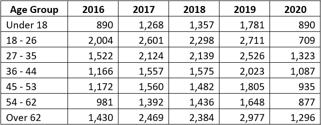
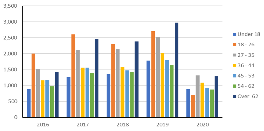
There’s a lot going on in both of these charts! If you look carefully, you’ll notice that the column chart’s “2016” group is identical to the column chart we looked at earlier. The one we looked at earlier, though was intended to convey a different message than what we’re going for here. If you recall, a column chart is a good choice for comparing actual values of different categories. Pick one of the age groups in this data set and try to follow its fluctuations. It’s not easy, the categories make a mess! The line chart makes it much easier to follow an age group’s fluctuations over time. Since a progression of changes is our intended message, the line chart is the best fit.
It’s all fruit
Each of the charts we’ve looked at accurately represents the sample data sets, but “accurate” shouldn’t be confused with “effective.” Effectiveness is the goal for your presentation as you pitch your idea to you co-workers and the board. Hopefully the tips we’ve walked through give you the confidence needed to build visuals that amplify rather than muddy your message.