


If you asked me to describe the graphical style of credit unions in general, my response would be immediate: stock photos.
Don’t mistake my meaning—in no way is the use of stock photography an inherently bad thing. In the last ten years, it has transitioned from a cheap alternative to hiring a photographer to a legitimately smart way of buying professional visuals.
The photos available have gone from campy office characters posing at their cubicles to gorgeous drone shots, natural backdrops, high-resolution textures, and effortlessly-cool people at work and play. There’s deliciously-lit food, slick vector landscapes, and just about every model of car on earth (minus their brand badges, that is). And the platforms selling them have advanced, too—the packages they offer are affordable for companies of all sizes, and there are some incredible free ones that give the big sites a run for their money.
So that’s it, right? Stock photos are great! Shortest article ever.
Here’s the thing, though: as much as they have improved, stock photos still have enormous potential to damage your designs, marketing, and brand if employed thoughtlessly. They are a useful tool, but they need to be used with care.
Build your space and play within it
For credit unions, the most essential quality of a stock image is whether or not it coheres to their existing brand. An image doesn’t need to be silly or unprofessional to hurt your brand’s value—it just needs to show poor consistency. A good brand demonstrates the solidity and stability of your credit union. If your brand is fun, your photography should be fun. If your brand is serious and businesslike, there’s a limit to the fun you can show in photos. It might feel limiting to you and your staff, but to your members, it will feel dependable and trustworthy.
Most brand guidelines have examples of photography in them as a jumping-off point for new designs—look at the style and tone of the photos, the energy level, the subject types (people, objects, settings, abstract concepts, 3D renders), and so on. Many brands forbid the use of clip art and illustrations, but others use them to inject fun and whimsy into their designs. If your credit union has a detailed brand guide, get familiar with how stock images fit into it.
If your credit union does not adhere to a comprehensive branding system, chat with your coworkers and brainstorm some boundaries. As with any aspect of branding, these should not be thought of as barriers to creativity, but as the walls of a sandbox, providing a sturdy context for new designs and ideas. Will your credit union use images of people? Will it feature their faces or just generic focal points like their hands and shoes? What demographics does your credit union serve and how will that be accurately reflected in the images you use? If you are going to allow illustrations, what style fits best? What styles are too weird? The more clearly you define these boundaries, the better.
Often, it is easier to define what you know doesn’t fit—for instance, the infamous “distracted boyfriend” stock photo—and work from there.
The only other note I’ll make on content is about using illustrations, icons, and 3D assets from sites like iStock, Getty, etc: be wary of locking your brand to a style that isn’t broadly available. If the designer of your favorite icons disappears from the internet, will you suddenly need to rebrand all your materials? If you love a very specific art style and want to design your brand around it, it is a safer bet to just commission a freelancer to build you a custom set of assets. That way, instead of being an anonymous buyer, sailing on the rough seas of the gig economy, you will have a collaborative working relationship with the designer.
Showing some restraint
Know when not to use stock photos. Many credit unions start every project with an iStock tab open, and it shows—every page of their online banking dashboard features a header bar of a person presumably thrilled with their savings account interest rate. Photos like these are fine for use in ads, but cheapen the integrity of utility-focused systems like online banking. Stick to simple vector graphics and solid colors for self-serve tools. Dealing with money is always stressful on some level, and your frustrated member is not going to appreciate looking at a model grinning back at them.
A good rule of thumb is to only use stock imagery when the mood is light and optimistic. Don’t use them near legal disclosures, detailed financial documents, apology letters, or anything related to fraud or security. Sure, you might have found an adorable clip-art of a padlock that would just look so cute! But it is never going to make your members feel more secure, so it undermines your ultimate design goal.
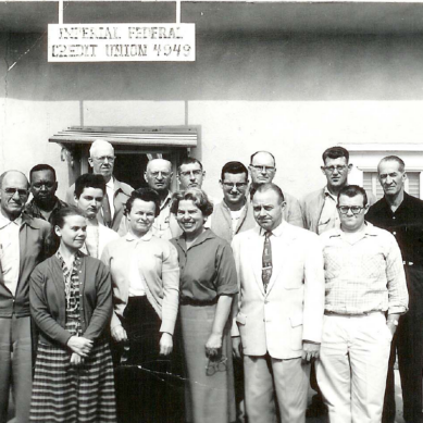
Another time to avoid stock photography is when you are trying to establish credibility with your members, such as when showing your staff hard at work. If your phrasing states or implies that the people in an image are your staff, they had better be. Don’t show an office, a branch, or a workforce that isn’t yours. I’ve written about this before, modern scams are shiny and full of stock imagery. Your members would greatly prefer a lower-quality photo of the truth than a beautiful lie. Social media also relies somewhat on truth and authenticity, so avoid using stock photos for your Instagram posts whenever possible.
Having said that, there are plenty of times when the goal of a graphic isn’t oriented around telling the present truth, but around showing potential futures (e.g. the happy result of a member using your services). In these cases, stock imagery can work perfectly.
Finally, remember that many graphics work better without photography at all: logos, branded apparel, physical giveaways like pens and pins, non-promotional HTML emails, and so on.
They’re just JPEGs after all
Now that we have covered the strategies, let’s talk about the technicalities.
When buying or downloading a stock image, your instinct should be to acquire the largest possible resolution of it. In 2022, these resolutions are often insane, like 5000 x 3000px. Will you need a raw image that large and detailed? Maybe not. But think about it from a campaign perspective: you are downloading the key component in a large collection of graphic designs (website banners, mobile banking banners, social media ads, print posters, large-format printed banners), each with wildly different technical requirements, from sizing to cropping.
Some mediums (such as poster prints) will require every pixel available, and some requirements might not even be known to you when you first grab your image. Higher resolutions might cost more, depending on your stock image marketplace, but they will save you future headaches and broaden your creative campaign possibilities. Believe me, having to explain to a credit union CEO why their image isn’t large enough for the graphic design they wanted is not a fun time—something I say from experience.
Similarly, because credit union advertisements and graphic designs tend to involve lots of text, and are presented with overlays (such as on mobile banking apps and social media platforms), an important thing to look for is open space. This could be a blurry out-of-focus area, a blank wall around your subject, a clear blue sky, or an area without a lot of dark-to-light contrast. Designers can typically extend these spaces in Photoshop, or cut out a clearly-defined subject, for tons of compositional options that will allow for maximum compatibility with banners of all sizes. So if there are two versions of the same stock image, cropped differently, opt for the one with more open space.
For images that do not have any open space, understand that for text legibility reasons, an additional backdrop will be needed (like a color-block text box). A fun and contemporary way to achieve this is by re-framing the image against a color backdrop, almost like a reference image in the margins of a textbook. This is a fun style and can look really elegant, so do not get caught in the trap of thinking about every image as a “background image”.
If you are worried about the usability of any particular image, fret not—it is standard practice to hand your designer a temporary version for them to mock up their graphics with. So long as you remember to replace it with a purchased copy before rolling it out to the public, feel free to use screenshots and inspect-tool-downloads to test out the right images before making a purchase. That is, if you can ignore the watermarks in the meantime.
For free stock image websites like Pexels, make sure you understand their usage license prior to using their photos. Typically you will not need to provide attribution or credits to the photographer but check beforehand to avoid any legal trouble. Most of these sites make it easy to make an optional donation to the photographer. If you plan to make a profit using their image, you should make a small donation—besides being a decent thing to do, it might also reflect well on your credit union’s word-of-mouth reputation.
A wide world, be that good or bad
Though this article has been largely focused on photography, there is far more out there than static images. Stock sites have massive collections of HD and 4K video, royalty-free music tracks, scalable vector graphics, raw polygonal 3D models, HTML web templates, and more. There is a whole world to explore, but the basic principles I outlined above apply. Your brand must always come first.
The potential is great—but stock materials will hurt more than they help unless you consider them in the context of your credit union’s brand, the mediums they will be used in, their technical limitations, and the perspectives of your members. Like all tools, they are only as good as what you make with them.