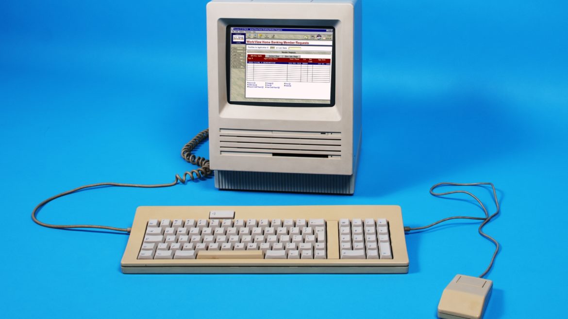
Who doesn’t enjoy looking at old photographs? Taking in the hairstyles, clothing trends, cars that defined the era. The wistfulness of thinking back to our personal experiences in those times. My technology life started after the sunset of typewriters on a boxy PC learning DOS commands. Typing class was an elective in High School, yet my Kindergartner now uses a tablet in ‘technology’ class. At the risk of sounding many years my senior, boy how times have changed.
One of the beautiful, and sometimes terrifying, things about technology is how quickly it changes. In graphical user-interface (GUI) design there is a delicate balance between chasing trends and building an interface that users aren’t in a hurry to replace. GUI design is one of the places where the adage “If it’s not broke, don’t fix it” rarely applies. How many of us knew keyboard shortcuts like a second language, while many users now operate a mouse like an appendage? For a GUI developer, this creates a unique challenge all its own. It’s an enjoyable challenge though, keeping the design current yet making sure we aren’t treating some of our users like nostalgia.

What it looked like to wait for dial up circa 2000…
As CU*Answers CEO Randy Karnes often likes to say, GUI is “lipstick on a pig.” This conjures a visual of me climbing into a pigpen, trying to delicately hold a tube of lipstick with farm gloves on, coaxing a less than enthusiastic pig to me for a makeup session. It also makes me wonder, do pigs even have lips? Hey Google! But I digress…
When it comes down to it though, his comment is mostly true. A square button and a round button do the exact same thing. To him, it’s the underlying software that defines whether that pig is show worthy or not. The “lipstick” is the flashy side, the colors that define an era so to speak. What matters in GUI design are the little touches to make sure all users have a positive experience.
It’s each button’s placement, not the shape or shading, that is important. Are the button placements relevant and consistent on the screens? Are the data fields lined up logically, offering a clean presentation that’s easy to tab or click through? If the GUI is done correctly the user shouldn’t give it a second thought, because the process of using the software becomes second nature. Nobody wants to drag through the day enduring poorly designed software. Good GUI considers a broad spectrum of users, then not only accommodates them, but empowers them.
I’ve always enjoyed describing my job to people. When I say “I’m a GUI developer” it tends to be met with cocked heads and more questions. “My job is making other people’s job a little easier” is my go-to for translating GUI developer into English. But for the life of me, there’s no better reaction than the wide eyes and laughter of my son’s friends when I reply that my job is “putting lipstick on a pig.”


